Wednesday, 21 October 2009

Caffeine Rushhhhhhh

Frost*


Naturally this post will be barely legible as i have had no intake but coffee and cigarettes today.
That being excused it delights me to finally do this post.
Having come across this book in the library a few weeks ago, it has taken me a while to motivate myself and borrow it from my house mate Tim. Looking back i can't imagine why it's taken me so long, bearing in mind how beautiful it actually is. It's not so much the content that inspires me, but similar to 'Tibor'  The layouts themselves as well as the fact everything is printed onto low GSM sugar paper, allowing the ink to seep into the pages and create a hazy, romantic, biographical narrative of Vince Frost's life in Graphic Design.
This was the book that even before 'Tibor' initially made me want to create a book of my own as it shows that the content may be dictated by the way in which it is presented.


It gives me an idea as to ways in which i may want to present my work in a concluding book and it's delicacy is something i too may wish to consider, although when the time comes such ethereality may be juxtaposed against cruder materials. The first two images serve a further purpose as inspiration to my deigning my own means of advertising material for Professional Development. The folded leaflets challenge shape in a way which interests me with my own and can act as an interesting piece of sculpture in their own right.


All pages copyright of Frost*, Frost Design, Thames and Hudson

Tuesday, 20 October 2009

meooooooooooooooooooow

Sunday, 11 October 2009

I promised myself this wouldn't be a diary

....but I suddenly miss the South so much.

Sometimes i can't think of a place that i belong at all and i never want to admit it if i do.

Today i decided that when i graduate i will run away and live down there with my dear friend Edi. What a perfect idea. She doesn't know it yet but it is necessary in my big life plan [like i have one] Hopefully she would still have her rats enabling me to have a pet finally.
This decision in itself is groundbreaking, i never really thought of a thing i wanted to do after Leeds, i only knew i wouldn't stay.
I suppose it's a cliche and inevitable, completely financially impracticle but couldn't care less.

I love my friends but Leeds seems so small and i feel like a sardine in a tin.

I want to up sticks right this minute, receive the familiar smell and sight of St Pancreas and run around London in the dark with a homemade pinhole camera.

If i do manage to raise funds for a visit this weekend perhaps i'll set up camp for life and never return to the stupid grim North.

Completely off the subject of any art. Just romantic aspirations. Rant over.

Thursday, 8 October 2009

Mama got a brand new hat ba daaaa

Fabrica

Stupid bloody printer / scanner / old mac.
 After an hour and a half, i had almost managed to conclude my scanning of Vit 3D and then for no apparent reason all the images have frozen and it won't let me save them [insert a mad or sad face here!!!]
Thank god for Hospital podcasts. As it goes the familiar loudness of drum and bass is the only thing that has saved me from standing on my mac. Currently i am having a little catch up session of 5 podcasts i have neglected to listen to for unforeseen reasons over the last couple of months. I forgot how amazing they are. Yes yes yes. Second to save me is an amazing Russian hat i bought today for far too much money. I look weird but it makes me really really happy.
This so far, has been a week of music and moving occurrences. My mind feels in a strange state of play between being inspired and swimming like a goldfish bowl. Today i actually realized just how much second year will entail and all i know is i now wish there were more hours in the day. Argh!!!!!!
I have all the ideas i'm simply having trouble putting them down, but there's no time to have trouble. Buggery.
Oh well.
Back to the subject at hand. Here i have my long overdue Fabrica post.

This book is sensational! Possibley one of the most relevant publishings i have looked at in a long while [not to say that i haven't seen some amazing books, this one just floats my boat greatly]
The works are hosted by a multitude of 'emerging' artist all going under the Fabrica 'brand' as it were.
Although the works are more related to advertising and photography the approach is [in my mind] very fine art, as it pushes social, mental and design boundaries. My chosen pieces offer a range of connections to my own work in both their messages and their subject matter, playing with the idea of optical illusion, alternate realities, humor, irony and sometimes the grotesque.
Innovative and inspiring to me it may be, but the work has been known to be banned and i know most people who view the works will question the need for such brutality. But for me it's about looking beyond that aesthetic, using that to initially create something interesting but which holds a stronger philosophy inside.
I like the way in which something can become something else, it doesn't have to be loyal to it's original use or state and Fabrica take on board this notion of alternative purposes.
C'est Tres Bien!


From Top to Bottom:

Wanted Creativity
Cacas
Fabrica Files - Electa
Personal projects
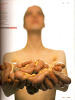
Teatri 90
Enemies - Oliviero Toscani
Colours Magazine
Kire - Erik Ravelo
Playlife T-shirts
If - Margo Quan Knight

Thursday, 1 October 2009

Something Good

Charles Avery

Waking up this morning a recieved a text message from dear Polygon reminding me that we had our first guest lecture at 4pm.
Charles Avery is a familiar name and i have seen his work but he's someone i had never researched into. I was dubious upon the start of the lecture as this very middle class man spoke overtly articualately at us all, with a crazy levl of vocubulary being sprung on us so that half of what he was talking about i couldn't understand. Then i sort of let it all wahs over me and as i did began to understand more what his work is about.
Avery has for the last 5years continued one ongoing project known as 'The Island'.
Some may consider this as repetative and tedious however the way in which he approaches his work allows him to take on every single detail of this mind boggling fnatasy world which he has cultivated.
"The Island" Is based upon his own interest with philosophy and ethics and each and every part of this world is symbolic.

With the use of philosophy in my own work, and his questioning of the laws of reality, science and maths, representing a philosophic world through sculpture and drawing. I felt the Avery lecture to be very relevant.


Had i been viewing his work in a gallery, it is likely i would have passed it off as being 'science fiction' art, as many critics have. But listening to him justify his works many elements i found it so dedicated and talented to be able to continue one project for so long. As much as it is about the physical objects themselves, for Avery it seems more to be about the story and world he has made that is the art itself.

Upon leaving i felt i wanted to make use of my own project in the best way possible and push the boundaries of reality.

Definately had a little love for him when i left the Lecture Theatre. Yessum.


Grape Face

Tibor

So my room is now all beautiful and tidy, homely enough for me to work in and even for others to visit me in, hence why today i go on to do further posts. On a less happy note this Mac is being slow and draining me so this post probably won't be too articulate.

If everything was as i wanted it to be i would now be doing a most important post on my encounters with the book 'Fabrica' but i'm silly and i don't have it with me, so instead i will go on to explore my findings within another book, entitled 'Tibor', about the works of Hungarian born Graphic Designer Tibor Kalman.
Whilst in the University Library I came across this book in the Graphic Design section. It may seem again like i'm jumping the shark a little, exploring layouts when i am yet to even create the pieces themselves. However looking at this book was one of the things that pushed me towards the the idea of making a book. I was always told at Sixth form that in art you can never be 'finished', so in order to plan my time wisely i am viewing all the possible options that can come post 'make', what i can do with a sculpture afterwards. It also will allow me to bring together the hybrid between Fine Art and Graphic Design.
It wasn't only a case of making a book because i felt i should do something after. My thesis is a narrative one, so it should be represented so that it can be read. Looking at some of the examples of Tibor's work, i found the layouts themselves interesting.
Sometimes the image itself perhaps isn't enough and it may be manipulated through the use of text alongside, different scales, quantity, position etc to bring out the full potential.

Of the layouts i have chosen, some have relevance to subject matter, and different attributes that i could see being in my own work. Some are just on here because they make me smile or think.

Going beyond my reasons for choosing this for research, i've grown a fondness for Tibor's work. He offered designs that were humorous and lighthearted whilst managing to send bold messages to audiences worldwide. Initially i read the book thinking it was a collective of several designers work, realising it was all one man's doing pleasantly surprises me, it's great to see someone who was so varied in their work but still remained identifiable.


You'll See

Graphistock

Graphistock is a collective of a variety of photographic works by an array of different photographers.
These pieces particularly caught my eye, i suppose partly through what they all bear in common, that being their soft, aged quality.


As the images go on, their subject matter too becomes more relevant. Moving into shapes, both 2D and 3D. Although a long way off yet, this has allowed me to consider photographically how i may look to portray my work, in terms of both performance and for cataloging purposes. My overall favourite being the last image of the wooden geometric blocks. Although the shapes are architectural and tapered, through the use of type, composition, palette some of the severity is lost and the image is forced into a nostalgic and warm aesthetic.


Artists, From Top to Bottom:

G.A Photography
Jan Camp
Roger Camp
Tom Collicott
Nola Lopez